Flow through the park | Layout of park uses | Visibility & sight lines | Role of the Park in the community | Sound, look, and feel of the park
See the Visioning page for details about who created these ideas and how they might get used.
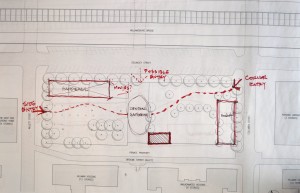
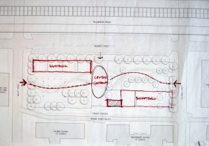
1. Flow through the park
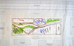
- There was general agreement about creating a gathering location in the center of the park, perhaps with a water feature and/or ability to use the space for performances like puppet shows; from recent experience with this, sound was not an issue.
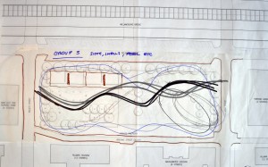
- There was general agreement that paths should be curvilinear to distinguish the park walkways from those on typical city streets.
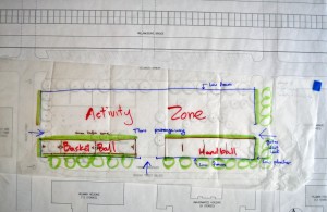
- Due to repeated concerns about noise close to Hillman from basketball courts, final design made courts 1/2 size vs. full (this was also based on observations of current use) and, in Scenario 1, placed courts perpendicular to Delancey handball courts on SE corner of park running along Columbia Street. In Scenario 2, basketball courts were placed parallel to handball, further east on Delancey. Concern with Scenario 2 is that it gives up “best part of park” in terms of winter sunlight.
- General agreement that entries to the park needed to be “democratic” and especially inviting to people north of Delancey and from Masaryk houses who are currently large proportion of park users. These community members often bring children to the park and on weekends barbecue or have family parties. To meet this goal, final entrances were placed on 1) NE corner @ Delancey/Columbia, 2) Ctr/Mid-West on Willett and 3) possibly Mid-North on Delancey to bring back a central view-through/thoroughfare from the original park design.
- General agreement to take full advantage of the park’s overall length vs. breaking it apart as it currently is into half-sections.
- Comfort station location suggested @ South-Central side along Broome Street.
- General agreement to balance open and closed spaces within the park. This conversation veered into fencing, with a suggestion to keep chain link to a minimum and use only in areas where required or find creative ways to hide fencing. In final presentation, others made mention of creative uses for walls with painting/murals and/or green walls, rock climbing, etc.
- Facilitator made a point of emphasizing NE corner as best winter section and SW as best summer section of park due to available sunlight.
- General agreement to reduce handball courts by one, due to observed usage, and to use the reclaimed space for a ping-pong table or to show movies against a wall.
- There were security questions regarding whether walkways needed to be of a certain width to allow police or park cars to drive through and also of the possibility of giving Hillman and/or Amalgamated residents keys to lock certain sections of the park.
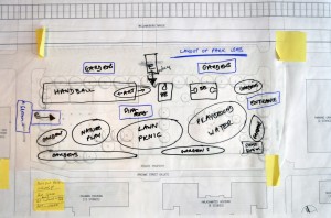
2. Layout of park uses
- Important to mix uses to be inclusive of all age groups.
- Integrate family use areas alongside sports/games areas – the closer proximity of children and older folks to the teens will encourage them to “keep it clean”.
- Should have planting/lawn/gardens/trees in as many areas of the park as possible.
- Garden plantings were typically located to be used as buffers and borders.
- Make use of the wide sidewalks to incorporate planting outside of fence along park borders – expanding park and softening effects of fencing. Creates a larger, greener sitting area on Willett side.
- Have a wider planted border along south border of park creating a buffer between housing and park
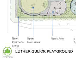
- A lawn + picnic area centrally located as a focal point, to unify the park, and to accommodate various programming like tai chi, parties, music, etc.
- Make the east and west entrances more grand, and keep the small center entrance for secondary access.
- Idea of having two play areas – one on each side of the park.
- One on the sunnier side for cooler season use and one on the shadier side for warmer season use
- One using more traditional play structures and one using a nature play/exploration like boulder climbing and woodland walk.
- One geared toward older kids and one toward younger tots.
- Water feature in park could be part of a nature play area rather than ornamental or a regular spray shower in a playground area.
- Basket ball courts moved to along Delancey side
- Make an art project out of fencing areas, particularly basketball and handball courts and possibly involve local youth in this.
3. Visibility & sight lines
- Currently, the park is visually too cut off from its surroundings and too cut off from itself internally. It’s too dark in some areas. And, being open all the time, it’s unsafe.
- Sight lines and visibility
- The east-west axis was noted as the primary line that should be opened up visually, so people can really grasp the depth and size of the park.
- It was suggested that increasing the visibility of interior elements from the outside was desirable and could be accomplished with a thematic cohesion of design elements, possibly raising the ground with small hills, more interesting water fountain, more visually attractive play features, etc.
- Fencing
- Overall, keep fencing as short as possible and remove as much chain-link as possible. Replace these with shorter wrought-iron looking fencing.
- If fencing must be of the tall and chain link, use the kind that is coated in a rubbery plastic and colored black or dark green. Something more visually soft.
- Move basketball courts to remove visual block in the east-west axis, make them parallel to this axis along an edge.
- Site basketball courts, if possible, so they don’t need tall fences, except behind hoops.
- A lockable fence was desired by all. It was noted that a shorter fence, as wanted elsewhere, even when locked wouldn’t necessarily keep out no-goodniks at night. However, it was also mentioned that other parks have short fences (such as Thompkins Sq) and don’t seem to have too many issues, and also that no height would keep out those who really wanted to break in after hours.
- Perimeters
- Use the cobblestone strip between sidewalk and current fence as a planting buffer: 3-foot fence, buffer, inner fence, use areas
- Use the cobble stone areas along the Willet St curb create a planting area.
- It was wondered if NYC Parks & Recreation could reclaim any of the sidewalk concrete for plantings. Some of the sidewalks along the edge of the park are unnecessarily wide.
- Lighting
- eliminate dark areas, especially around seating
- maybe softer lighting lower to the ground in greater numbers would be better than fewer but brighter lights that would irritate neighboring residents and look garish.
- it was raised as a concern that the block along Delancey west of the park is dark; better lighting here would make the park seem safer and more inviting.
4. Role of the Park in the community
- Key points:
- Need multiple uses
- Public programming can include performance, music, and dance
- Weekly market to include local businesses: farmers market, artisans, etc.
- Flexibility of spaces – moveable furniture for example.
- Free flow between areas
- Open space to accommodate spontaneous activity
- Create magnet activities
- Incorporate art into fence design
- Drawing people into the park – create alot more green space, move the playground nearer to the center
- Use cobbles in some hardscape design elements
- Concerns/questions from the audience:
- The need for engagement of area teens – incorporate art projects for teens into the final design
- Be mindful of noise issues for residential space that borders the park with regards to placement of the basketball court
- Basket ball courts are of historical importance to the park since Luther Gulick was instrumental in the creation of the sport of basketball
- While placement of the basketball court along Delancey might solve the noise issue, that area gets the most light and should be used for green space.
5. Sound, look, and feel of the park
- Currently, the park feels unpleasantly grey and overly paved. The sound from the current playground equipment is unpleasant and grating.
- All agreed that there should be a greater variety of surfaces and feels throughout the park.
- The sound of moving water would be a nice buffer and have positive effect on park-goers
- Kids say
- There should be softer ground cover and more modern play equipment
- Natural play areas are a good things: rocks, boulders, water as in Teardrop Park, e.g.
- Murals on the handball walls to bring color
- Varied topography, such as a hill or incline, would be good–perhaps also a sound buffer.
- Wilderness and organic design became a prominent theme of discussion
- Grass is vital
- The use of natural materials (wood, stone, etc.)
- Meandering paths
- Moving water running through the park was seen as a positive. Perhaps a ‘stream’ bed that doubled with an alternate function in the colder seasons
- It was suggested that increasing the feeling of wildness in plantings and pathways would create a sense of ‘great design’ and be an attraction compared to other parks in the area.
- Creating a feeling of *more space* through design is considered important–it was suggested that a meandering path would help
